This decade, the golden rule for style was something easy to read in newly responsive layouts. This was very welcome after the glossy surfaces and shadows the ‘web ‘2.0’ brought. However, as ideal and nice the flat color design can be, it can become too popular. That is why we will present some nice ideas for UI Design here. Take a look.
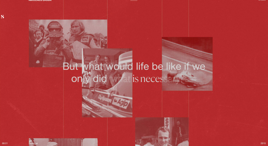
Faded memories
The faded style adds some nostalgic feeling to the website. It was used in a digital tribute Obys Agency paid to Niki Lauda. It is a great alternative when trying to bring memories and different websites and proyects use it to channel nostalgia and remembrance.
Paper grain
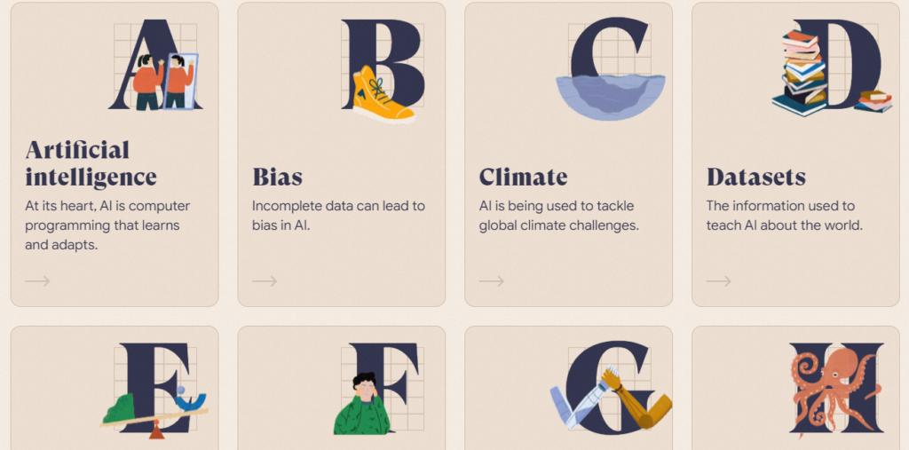
One of the biggest examples of this style was a project by Google named “The A-Z of AI”, which was published in 2019. The styling chosen for these explanations of the basic concepts of AI was modern and easy to understand. It has a vibe similar to a children’s book,which gets more attention once you notice the paper grain.
Halftones
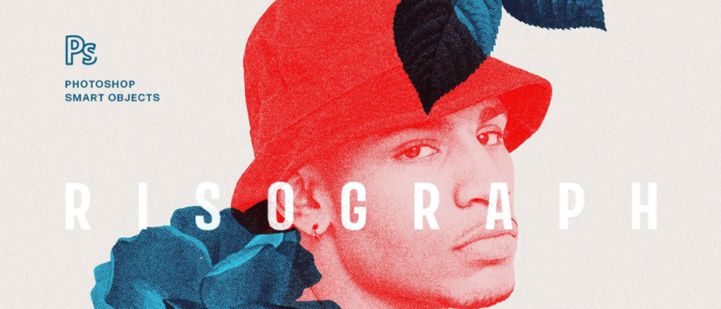
Halftones give an interesting aspect to a website. However, keep in mind that not all images are suitable for this style. Usually, high contrast images are the best ones. Another advice is to choose a regular grid because a very fine grid can make files really big and heavy.
Paints and Pencils
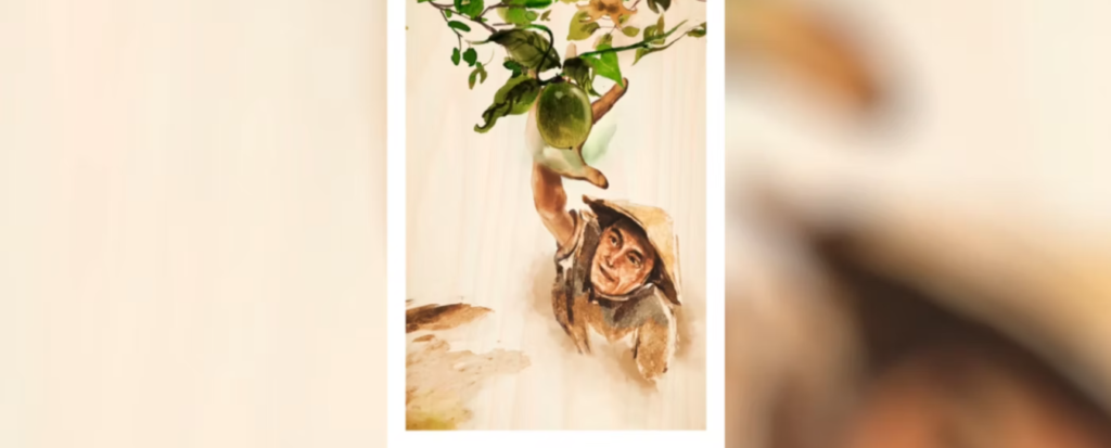
Computer graphics and digital resources are made to be precise, which is great for the effects of traditional media while keeping your desk clean. Paint, pencils and organic looks give websites an interesting and lovely aspect, while making them unique. Here is an example of these patterns used by Airbnb.
What do you think about these pattern ideas for UI Design? At Glajumedia, we take UI design approaches from the very early stages so you are happy with your website and its results. Whether you want a Shopify site, a Woocommerce site or even if it’s not an ecommerce, Contact us today and let us help you build the site of your dreams.
