

If you work with a CSS file, you know your way around this world. Some people might say that CSS is a straightforward language, so it makes it hard to make a mistake. By putting a set of rules for your website, it doesn’t mean that it’s done. However, some small sites only require a couple of CSS files, the rule before mention might work. In other cases, such as large applications, some situations can get out of control. The big question is how you can manage these kinds of situations?
Here are 5 tips for your CSS which can help you to bring out the best from your styles.
FRAMEWORKS OR NOT?
Your main step is deciding if you really need to use a CSS framework. There are many lightweight options for a robust framework. Also, some of the selectors from a framework, you might never use, so your bundle will contain dead code.
By using styles only for your buttons, you must outsource them to your CSS file and delete the rest. In addition, you can find unused CSS rules code by applying for coverage in DevTools.
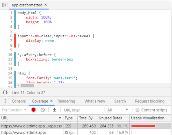
To find it, you must look for Coverage in the Tools panel. Then, you access to the Tools panel by using Ctrl + Shift + P. You need to start recording by clicking on the reload button. Now, everything that pops up in red is unused.
USE A MARKUP
Your CSS can get overload sometimes. Thus, you can minimize the size of your CSS bundles by using the right HTML elements. For example:
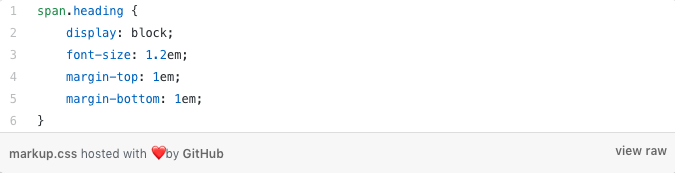
With a span element as a header, the default display or font style will be revoked. This helps you by using an h1, h2, or h3 instead. They already have the styles that you need to for other elements.
REDUCE REDUNDANCY
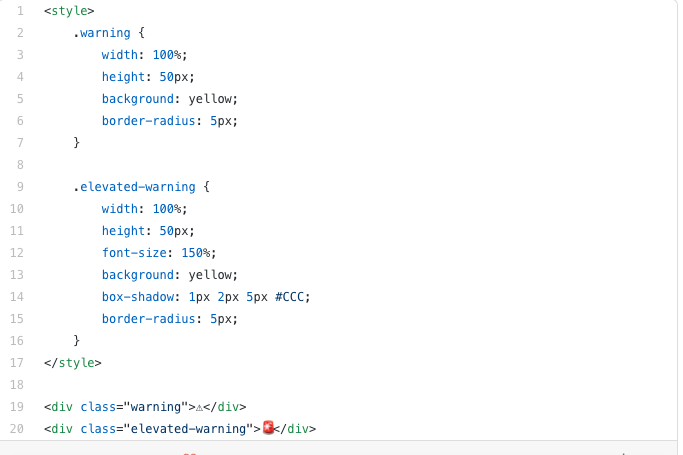
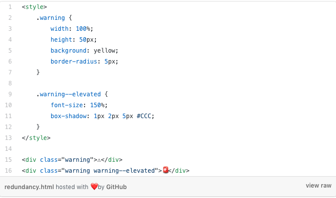
On some occasions is hard to spot a redundancy, and even more when repeating rules don’t follow an order in the selectors. However, it is better to outsource your rules when your classes differ and use them as an extra class.
Try something different
DON’T TAKE OUT OUTLINES
When writing CSS, this is one of the most common mistakes developers make. Even if you think that is not necessary to remove the highlight that outlines create, you are making your site inaccessible.
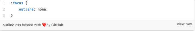
Note: users using only keyboard navigation won’t have an idea about what they are focusing your site. Also, elaborate custom outlines, if the look doesn’t match your brand.
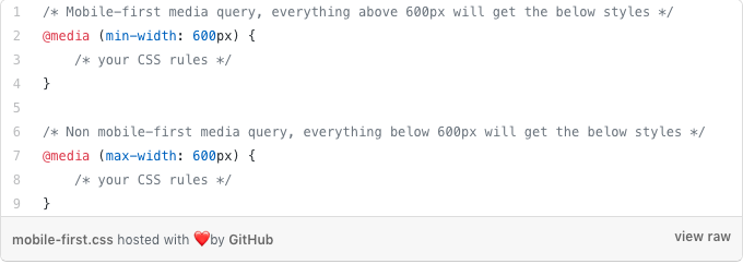
USE MOBILE FIRST
Use a mobile-first every time that you have a deal with media queries. This means that mobile will be your first approach by writing CSS for small screen devices It will ensure that you add extra rules for your large devices, rather than rewriting your CSS rules.
Here at Gladumedia, we provide state-of-the-art technological solutions through our CSS knowledge. Whether your company needs IT, development, e-commerce, or cloud solutions, we have the experience and expertise that any digital project demands. Contact us today to learn more about our offerings!