
Most people just pull their phones every time that they need a quick answer or solution to something, Of course, this action is becoming more a necessity than a commodity. In 2016, mobile web usage exceeded desktop usage for the first time, and businesses are still adjusting to this change.
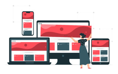
Part of offering the best online services or products to your customers, you need to look into details. The main point about this article is deciding how your website is going to look at the phone. Here, you will find a couple of options: mobile-friendly and responsive design. Explore and find out which of them works best for your business needs.
RESPONSIVE DESIGN
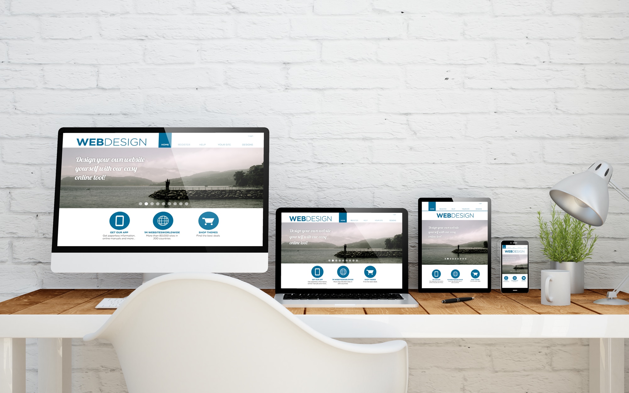
This type of design is the one that changes based on the screen size of any mobile device. For example, text and images change to a single column display, irrelevant images that can interfere or compete with more relevant information on the site. Another way to know if a website is responsive when you shrink the browser and see whether or not the display changes to match the window size.
Main characteristics:
- Dynamic content that changes
- Simplified navigation
- Images display smaller
- It doesn’t depend on the phone operating system
MOBILE-FRIENDLY
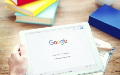
Do you know that Google’s search rankings now emphasize and reward mobile-friendly sites? Well, they do! A mobile-friendly site looks the same way in any device. This means that this design does not change depending on which device you use. This means features like navigation drop-downs are limited.
Main characteristics:
- Reduce the time needed for a site loading
- Top on Google’s ranking
- Supports more browsers
CONCLUSION
No matter what, you need to approach your customers on their phones. Besides, you cannot forget that Google ranks mobile sites above desktop sites for SEO ranking. This means that every time that someone searches from a mobile, a website will rank higher because of its optimization for mobile viewing. Therefore, you should ask yourself the following questions before taking any decision:
- What is the purpose of the website?
- What is the end goal of visitors to the website?
- On what device do I expect my visitors to visit the site?
Get in touch with us today! You can find more information about which mobile design works better for your website.