")
Have any of you ever ask yourself about a mobile-friendly website? If you took the responsive design route, then you must establish a strategy to make a responsive image. The basic rules are simple after your master by starting scaling the images.
You might also face performance and art direction to solve some issues. There are many practices to create a responsive image and each of them with its weaknesses and strengths. This article will help you to fight two enormous enemies: responsive image and deadlines.

PICTUREFILL
The internet is worldwide, but we forget that not everyone has the same quality access to fiberoptic connections and 4G networks. Scott Jehl has realized this digital divide about the idea of mobile-first and responsive sites. Jehl has a picturefill script that proposed <picture> element. It is a JavaScript code that imitates the picture API.
Picturefill doesn’t need jQuery, but it requires the picturefill.js script. Another requirement for Picturefill is some special markup with divs to represent the image variation, differentiated by data-media attributes that act as media queries in CSS.
Since Picturefill requires a lot of custom markup, it isn’t the best choice if you cannot alter your website’s source code.
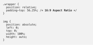
NETFLIX WAY
It is a little trick that works everywhere, where you need to wrap your image with a relatively padded parent. Here, you will keep the responsive image ratio with a percentage on the padding property.
The code looks like this:
ADAPTIVE IMAGE
Adaptive images, created by Matt Wilcox, is a server-side solution that requires a little bit of JavaScript. However, the hard work is managed through the Apache 2 Web server, PHP 5.x, and the GD library.
To add it to your Web server, you should use the .htaccess file, next upload some PHP files to your website’s root directory. You have to add some JavaScript to your pages and modify some breakpoint variables in the PHP files. In this way, it will match your website’s media queries.
An advantage of using Adaptive Image is that it doesn’t require a custom markup on your images. When everything is completed, the PHP script will intercept any request for a picture and resize it as your specific breakpoint sizes and deliver it on your pages automatically.

CAPTURING/MOBIFY.JS 2.0
It is a new feature from the in-development Mobify.js 2.0, which gives you access to the HTML. At this stage, you will be able to swap an image’s src attribute before the browser downloads it. Capturing is a technique that directly circumvents native browser preloading, which can cause a performance issue if it is misused.
The ways from above might not be the only ones, but not consider enough in your business site. Indeed, it can help you with CSS practices to create responsive images to improve your business site. Above all, developers at Glajumedia can give you that peace of mind by expanding your website.